“Design is a reflection of the designer. Simplicity in design mirrors clarity in intention. When the ‘why’ is evident at every step, the design process becomes intuitive. It requires empathy and a keen awareness of the audience’s needs. In my journal, the uniform uppercase letters create a rhythmic texture, echoing the consistent yet extraordinary nature of daily life. Moments of joy, like a shared laugh, hold the same significance as discovering the perfect font for a logo. My primary role as a graphic designer is to distill messages to their essence, ensuring every element serves a purpose.”
Interview
Prarthana Gandhi is a designer who thinks in letterforms and lives through rhythm. Her relationship with type began in childhood and has quietly matured into a design practice rooted in clarity, control and a deep respect for structure. In a world that often rewards noise, she’s more interested in precision—using less to say more, with honesty guiding every decision. Her work reflects an ongoing conversation between restraint and emotion, between repetition and spontaneity. We spoke with her about minimalism, process, discipline and the slow evolution of self through design.

Interviewer: You’ve described type as your oldest companion. What do you mean by that?
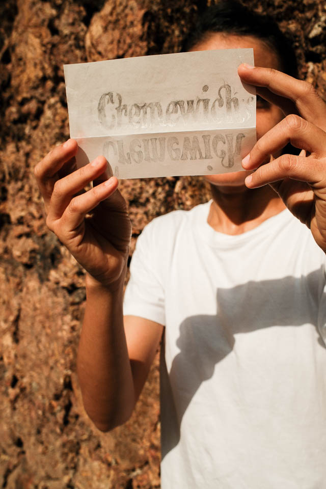
Prarthana Gandhi: Type’s been there longer than most people in my life. As a child, I was the one hoarding newspaper cutouts, drawing headlines for school charts, and spending more time designing the margins of notebooks than filling them with class notes. Lettering felt like a private world I could control—where nothing had to be explained and everything had a reason to exist. There was no pressure to perform, no one watching. Just the quiet pleasure of drawing the same letter over and over till it felt right.
When did you realise this obsession could become your profession?
It wasn’t a dramatic shift. Looking back, it was the only direction that ever made sense. I wasn’t drawn to design because of trends or visuals—I was interested in how form carries meaning. Choosing visual communication wasn’t a ‘decision’ in the usual sense. It was more like stepping into a room I’d already been living in.
You’ve called type “the texture of a message.” What does that mean in practice?
Type changes how you receive information. It’s not just about legibility—it’s about tone, emotion, presence. The same words can feel serious, casual, intimate or cold depending on the letterforms. It’s why I see type as more than a tool. It’s a voice. It shapes the experience of reading. Design for me starts there—how will this be felt, not just read?
You seem to work from a strong philosophy of reduction—less is more. Where does that come from?
It’s part personality, part habit. I like order. I like minimal, clean spaces. Even in conversations, I find myself mentally editing—asking, “What’s the point?” I carry that same urgency into design. I’m always stripping things back. What’s necessary? What’s adding noise? What’s diluting the message? I believe less always gets more attention, because it stands out in a world full of clutter. That impulse—to clarify, to organise—that’s how I make sense of things. Design just gives it a structure.
Would you say design mirrors your inner state?
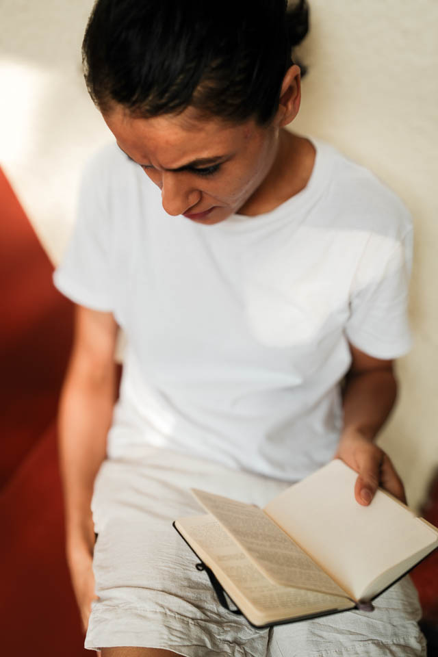
Absolutely. My notebooks are a good example. I write in 4pt uppercase letters—tight, even lines. There’s something meditative in it. That texture, that discipline, reflects how I’m wired. Every time I write, it becomes a check-in with myself. What am I feeling? Where am I mentally? The kerning, the rhythm, the flow—it all mirrors what’s going on inside.
Where does intuition fit into your process?
It leads. I plan less than people expect. If the intention is clear, the decisions follow. You don’t need to overthink when you trust your eye. Of course, there’s skill, training, years of practice—but instinct has always been more reliable for me. I value empathy more than aesthetic. If you understand the person on the other end, you’ll design well. Everything else is detail.
You often talk about the difference between art and design. How do you draw the line?
They share a lot. But for me, design ends in resolution. It solves. Art begins in ambiguity. It opens up space for questioning. I need both in my life. Design satisfies the organiser in me. Art allows me to sit with doubt. The balance of the two keeps me creatively sane.
What does your creative practice look like outside of work?
Late nights, quiet, and my Moleskine. That’s when I go back to writing, drawing letters, spacing things out. I’m not designing anything specific—it’s more about being present with form. There’s something grounding in that. Sometimes I get answers, sometimes I just get better at listening to myself. Either way, it’s necessary.
What are some personal or professional challenges you’ve faced, and how have they shaped your practice?
The work evolves as I evolve. Design isn’t a fixed skill—it’s a reflection of who I’m becoming. Challenges have pushed me to slow down and listen. I’ve had to unlearn a lot—especially the need to get it right the first time. Yoga has helped. The repetition, the stillness, the act of returning to the same pose, the same breath—it’s grounding. That repetition builds clarity. It seeps into the work. With time, I’ve realised that steadiness is more powerful than speed.
Do you see a difference between who you are and what you create?
No. There’s no split. Everything I design carries a bit of me. It’s not performative. It’s not separate. I am what I make. And I hope what I make feels honest, because that’s the only measure I really trust.